The challenge
E-ZPass users often learned about account problems too late. Balances, violations, and fees were hard to find in the existing experience.
Case study
A mobile UX concept for E-ZPass account management that focuses on clear information structure, timely alerts, and accessible design.
The challenge
E-ZPass users often learned about account problems too late. Balances, violations, and fees were hard to find in the existing experience.
What I delivered
A mobile interface that shows account status clearly, sends timely alerts, and gives users direct paths to add funds or pay violations.
E-ZPass account management can be difficult to understand. Balances, violations, and payment deadlines are easy to miss. Users often learn about problems only after fees have increased.
This concept focuses on digital transparency. It presents account information clearly and gives users time to act before problems become more costly.
Role: UX/UI Design Concept
Drivers did not have clear visibility into account status. Negative balances, threshold warnings, and violations were hard to find. This made it more difficult to respond before penalties increased.
The mobile interface prioritizes clear status, timely alerts, and direct actions:
Click any screen to view it larger.
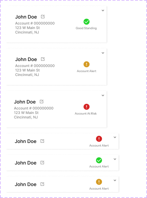
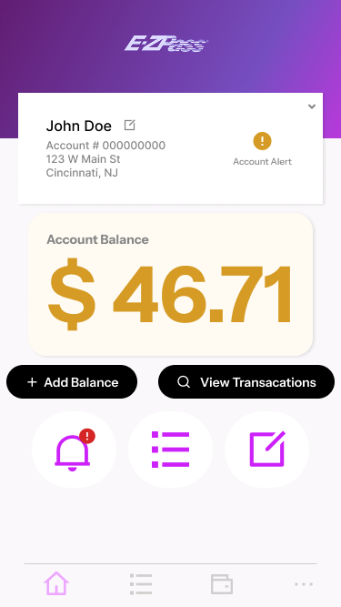
Account status cards use color and labels to show good standing, alerts, and at-risk states.
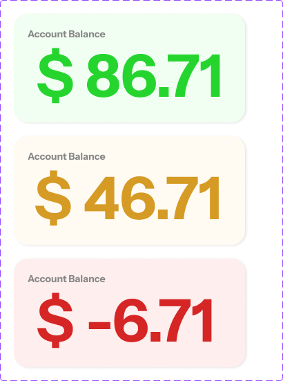
Balance display changes color based on account health.
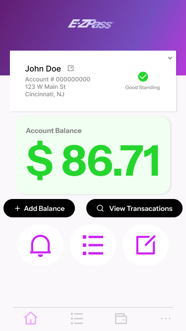
Good standing view with balance and status shown at the top.
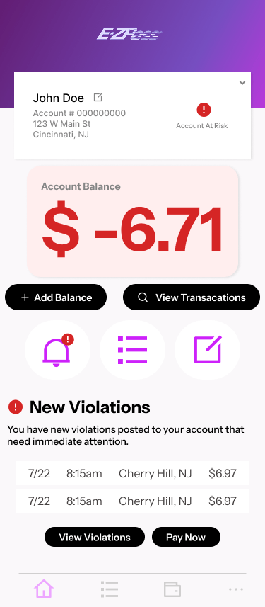
At-risk view with a visible alert when the balance is negative.
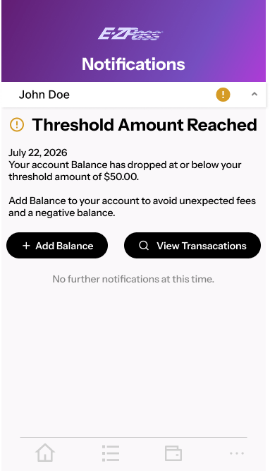
Threshold alert shown before the balance goes negative.
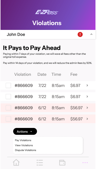
Violations screen with honor-system payment options.
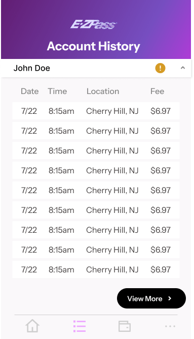
Transaction history in a scannable table format.
Notifications collected in one view.
This concept shows how clearer information structure and timely alerts can make toll account management easier to understand. Users can respond to problems earlier, reduce unnecessary fees, and stay informed about account status.