The challenge
Rutgers lifelong learning programs used separate systems. Students and staff had difficulty finding courses, managing listings, and completing registration.
Case study
A Rutgers course management and registration platform that supports multiple departments in one application with shared navigation, admin tools, and a consistent registration flow.
The challenge
Rutgers lifelong learning programs used separate systems. Students and staff had difficulty finding courses, managing listings, and completing registration.
What I delivered
Course Hub, a single application that supports multiple departments with shared navigation, course management tools, and a consistent registration flow.
Before Course Hub, Rutgers lifelong learning programs used separate systems. These programs included government services training and professional master’s courses. Students moved between disconnected sites. Admins repeated work across departments. Registration paths were not consistent.
Course Hub combines these programs into one application. It uses shared navigation, centralized course management, and a registration flow that guides users from browsing to checkout.
Role: UX Designer and Co-developer
Each program area used different layouts and admin workflows. Users did not have a consistent way to find courses or complete registration. This created problems for students, admins, and staff who maintained separate tools.
Course Hub uses a shared application structure. Each department keeps its own branding, filters, and permissions. Programs such as CGS and MBS look distinct to users but follow the same underlying patterns.
Click any image to view it larger.
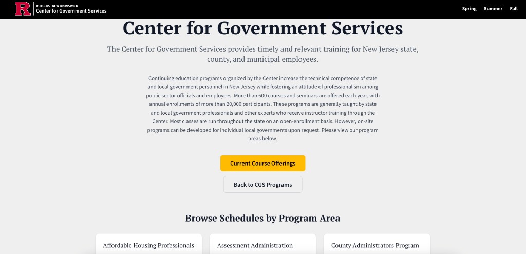
The CGS landing page lists more than 17 program areas in one place. Users can move from program discovery to seasonal course listings with the same navigation used across the platform.
Government training programs now share one entry point with the same layout and navigation model.
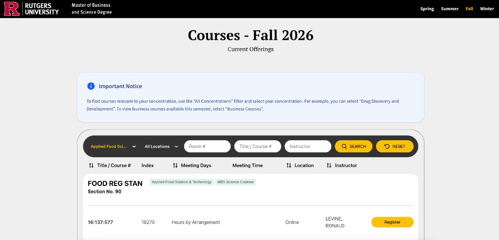
The MBS Fall 2026 catalog shows how the platform handles large course catalogs with filters and sortable listings.
MBS uses the same catalog structure as CGS, with filters and registration adapted for a larger course inventory.
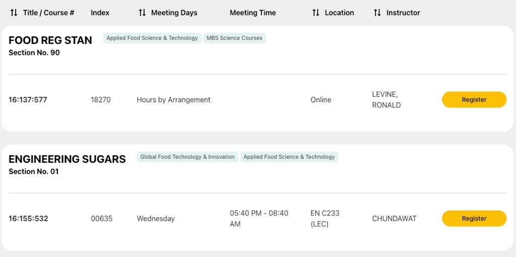
Users need to search quickly and browse in depth. The filter bar supports concentration, location, room number, title, course number, and instructor. Table columns can be sorted so users can reorganize results.
Users can filter by multiple criteria across large course catalogs.
Course listings use a responsive layout that works on mobile and desktop.
Design decisions:
Color is used to communicate status and category. Concentration tags, alert types, override states, and primary actions each have defined colors.
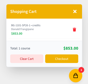
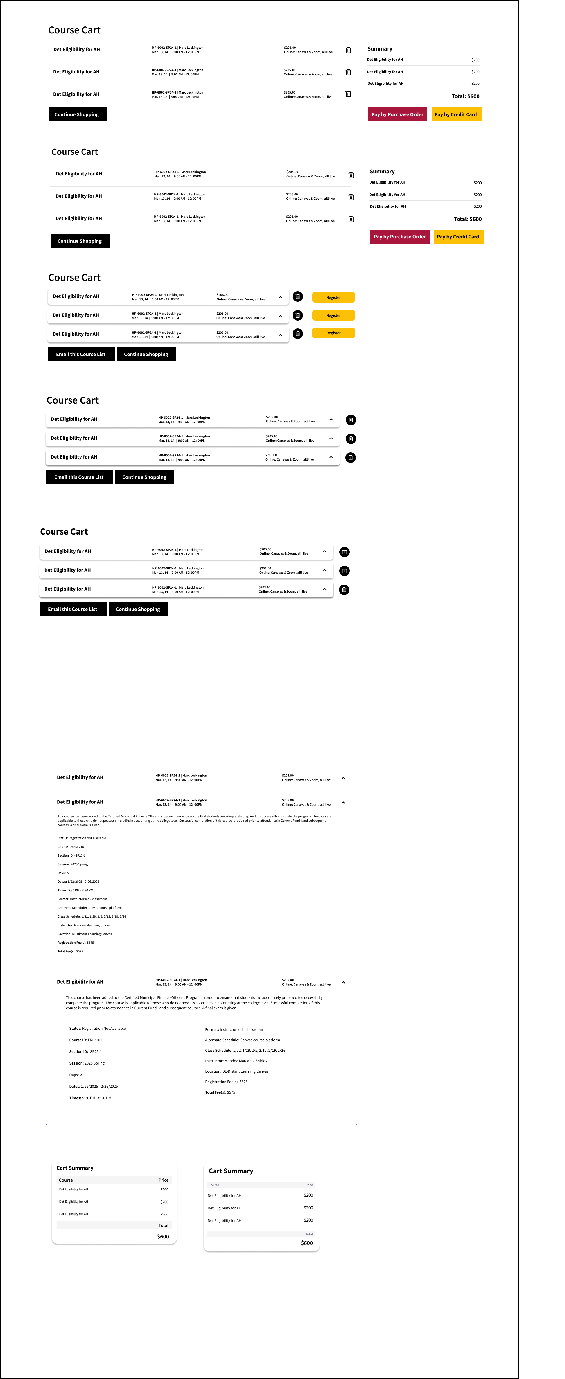
The registration flow was tested through prototypes and user polling before development. The cart shows course details, pricing, and checkout actions in one overlay.
The cart shows item count, pricing, and a path to checkout.
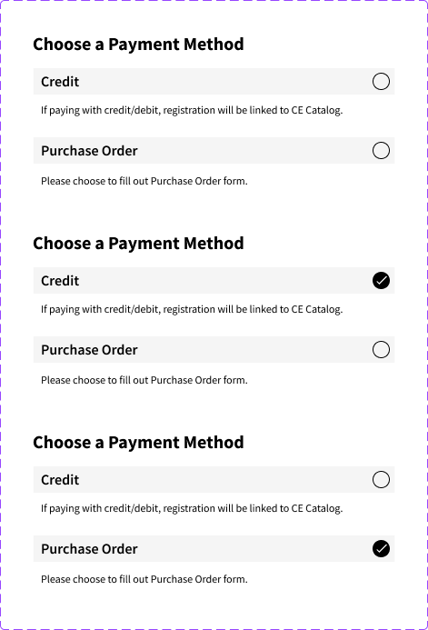
Cart layouts and payment screens were tested in Figma before the final build.
Cart layout options were tested to reduce confusion during checkout.
Payment method selection was designed to be clear at the final step.
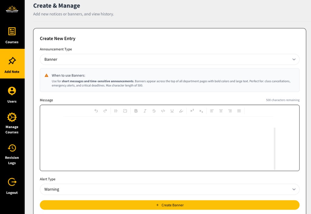
Admins need tools for banners, overrides, user management, and change tracking. The admin panel uses sidebar navigation, typed actions, and required confirmations before changes go live.
Admins can create banners that appear across department pages with defined alert types and character limits.
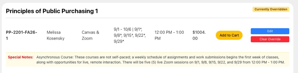
Admins can override course listings when schedules change, courses are canceled, or prices need correction. Override status is visible in both the admin panel and the public catalog.
Overridden courses show a badge and options to edit or clear the override.
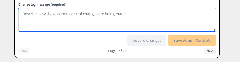
Each admin save requires a change log message. The control panel also includes a Revision Logs section. Together, these features record who made a change, when it was made, and why.
Change log messages and revision logs create a record of admin edits across departments.
Course Hub replaced separate program sites with one platform. Users can find courses more easily. Admins can manage listings with a clear record of changes. Rutgers can support new programs without building a new system for each department.